Web Design Rules and Guidelines
94% of users judge a website by its design. With short attention spans, good visuals are key to engaging visitors and boosting conversions. As web design changes fast with AI, mobile focus, and new tech, I'll share simple tips to create responsive, unique websites. Whether a simple portfolio or bold online store, these ideas will help you combine looks and function for better user experience.
Take Apple's website—its elegant personality shines through with high-quality product images and minimalist typography, leading to a 30% higher conversion rate compared to cluttered competitors like early eBay designs.
# Website Personalities
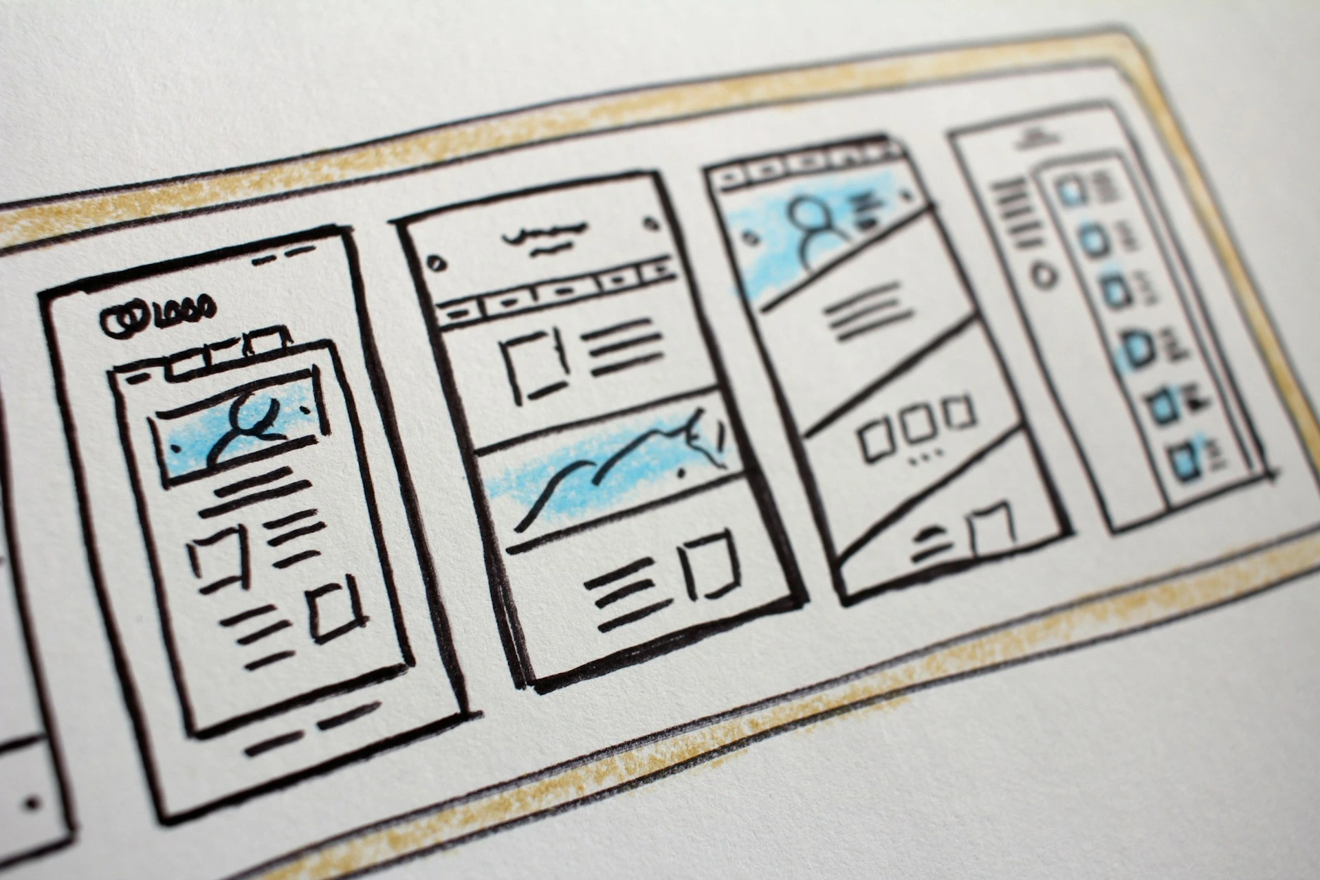
Every website has a personality that matches its brand—serious and elegant for luxury brands, or playful and fun for creative startups. Matching design elements to these traits creates memorable, emotional experiences for users. This section covers the seven main personalities and how they guide choices in typography, colors, and more.
- Elegant Personality: Ideal for high-end services; use thin serif fonts, pastel/golden palettes, and hero images of refined lifestyles.
- Minimalist: Focus on content clarity with sans-serif blacks, sparse icons, and ample whitespace for readability.
- Bold: Command attention via oversized bold type, vibrant blocks, and dynamic layouts for impact-driven sites.
- Startup: Energetic vibe through medium sans-serifs, light grays, and rounded elements to convey innovation.
- Calm: Evoke trust with soft pastels, rounded serifs, and soothing illustrations for wellness or care-focused brands.
- Neutral: Corporate staple with structured grids, neutral fonts, and subtle accents to prioritize information over flair.
- Playful: Infuse joy with colorful rounds, hand-drawn assets, and subtle animations for engaging, youthful audiences.
# Typography
Typography isn't just about fonts—it's the voice of your site. Limiting choices and scaling sizes strategically ensures hierarchy and accessibility, aligning with 2025's trend toward bold, experimental typefaces that enhance mobile scrolling experiences.
- Use popular, safe fonts from Google Fonts, limiting with 1 or 2
font-familythat fit the personality. - Apply a type scale: body text
16-32px, bold headlines50pxor larger for consistency. - Use
20pxor more for long text; keep line length under 75 characters and line height1.5to2. - Try more
letter-spacingfor short titles; avoid justifying or centering long paragraphs. - Keep font weight
400or higher; reduce letter spacing in headlines for smooth reading.
Example: The New York Times blog uses a consistent 20px body font with generous line height, making long articles scannable and reducing bounce rates by 15%.
# Color
Colors affect feelings and guide attention. Choose them to match your brand and keep accessibility in mind. In 2025, bold contrasts and AI-made palettes are popular for vibrant, inclusive designs that can boost engagement by up to 20%.
- Pick main colors that fit your brand (e.g., pastels for calm) and balance with grays; use tools like Coolors for accents.
- Make tints and shades for flexibility; main colors go on CTAs, accents highlight details.
- Use lighter text on dark backgrounds, without pure black or white extremes.
- Blend colors in images for unity; test how they affect emotions.
Example: Spotify uses bright greens and blacks to increase playlist clicks by 18%.
# Images, Illustrations, and Icons
Good visuals support your message without slowing the site. Crop, compress, and combine assets wisely. Trends like 3D illustrations and AI-upscaled images create immersive experiences in 2025.
- Choose relevant, original images; show real people to build connection; use gradients or boxes for text overlays; upload double-size compressed files.
- Use one SVG icon set; match icon roundness to fonts; use with text labels for features or bullet points; color icons to match or accent.
- Use scalable, fast-loading visuals.
Example: Duolingo’s hand-drawn owl icons and compressed images keep mobile load times under 2 seconds.
# Shadows, Border-Radius
Subtle shadows and rounded corners soften look.
2025 highlights micro-interactions with hover effects for a tactile feel.
- Use light shadows sparingly for subtle lift; bigger shadows for emphasis; animate on hover.
- Match border-radius to font style for playful buttons and images.
Example: Notion uses soft shadows and 8px border-radius on cards for a calm interface.
# Visual Hierarchy and UX
Hierarchy directs attention; UX makes navigation easy. Site speed affects rankings. Slow sites lose conversions (~7% per second delay).
- Place important items top and emphasize with
size,color,weight, andspace. - Highlight areas like testimonials with
backgroundsorshadows. - Use familiar patterns, clear headlines, quick animations (200–500ms), and aligned forms with feedback.
- Break text with subheadings and images; use simple language; place actions where users expect them.
- Track UX: Monitor bounce rates and loading times
Example: Amazon’s bold “Add to Cart” buttons increase impulse buys by 12%.
# Components, Layouts, and Content Strategies
Combine standard components like cards and grids into tested layouts for efficiency
- Use common elements in patterns like hero or features.
- Optimize content marketing—add SEO-friendly alt text and create downloadable checklists for backlinks.
- Keyword Research: Use AI to find phrases (e.g., “responsive web design tips”) to include in alt text and headings.
Example: HubSpot doubles leads using grid layouts with animations guiding users through funnels.
# Conclusion: Master Design Trends and Performances
In 2025, web design changes fast. Using colors that fit your brand, focusing on user experience, and using AI tools helps make websites that attract and keep visitors. Test your pages, design for mobile first, and keep checking to get better.